Tooltip
Tooltips display additional information upon click, hover, or focus. The information should be contextual, useful, and nonessential.
Overview
There are three types of tooltips:
- Icon tooltip
- Definition tooltip
- Interactive tooltip
Live demo
Placement
Icon tooltips and interactive tooltips may be positioned top, bottom, left, or right to the trigger item. The container of the tooltip text may be aligned to start, center or end.
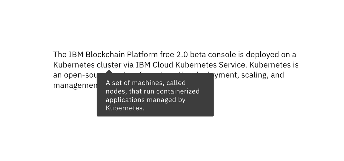
Note that left and right positioning is not available for definition tooltip. This ensures the tooltip does not obstruct important information to the left or right of the trigger word.
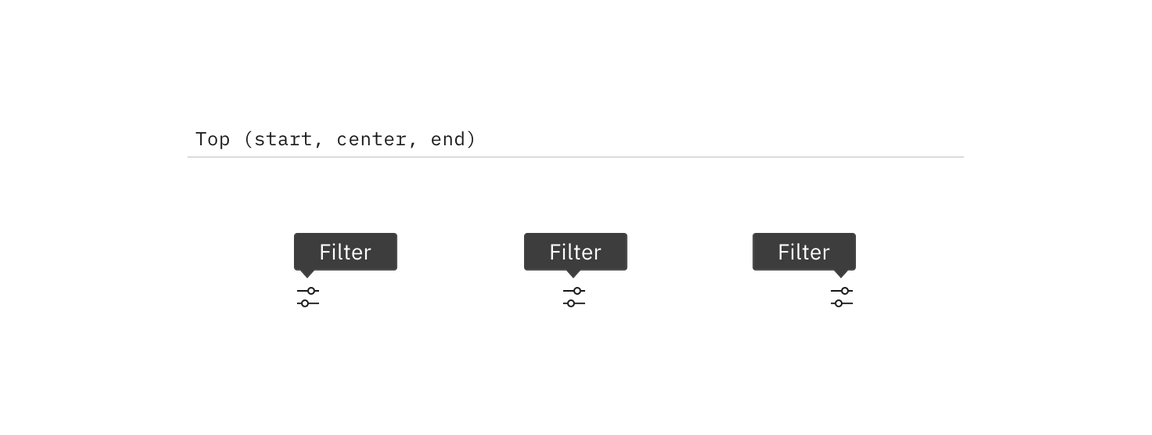
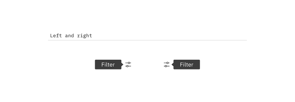
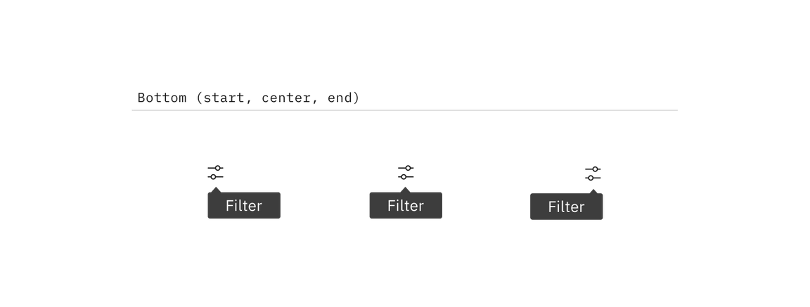
Component types
Tooltips provide additional, contextual information. Each variant achieves this for different design needs.
Icon tooltip
An icon tooltip is used to clarify the action or name of an interactive icon button.

Guidance
- The tooltip content should only contain one or two words.
Behavior
- Icon tooltips appear on
hoverandfocus.
Definition tooltip
The definition tooltip provides additional help or defines an item or term. It may be used on the label of a UI element, or on a word embedded in a paragraph.
Guidance
- Should contain brief, read-only text
- Use on proper nouns, technical terms, or acronyms with two letters or more
- Do not use a definition tooltip on words with fewer than two letters
Behavior
- Definition tooltips appear on
hoverandfocus
Interactive tooltip
Interactive tooltips may contain rich text and other interactive elements like buttons or links. In general, hiding interactive content in a tooltip is discouraged. Interactive tooltips are best used for onboarding experiences and product tours.
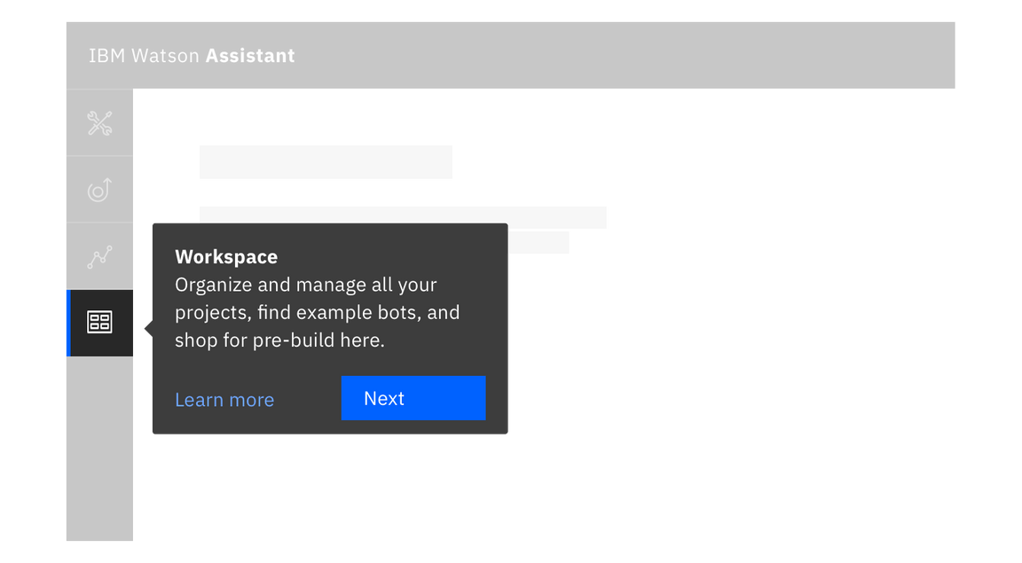
Guidance
- If a user may need to visit an external resource, like while using a form, include a link in your interactive tooltip
- Don’t use without a label. Consider the context a user needs before clicking a link
Behavior
- Interactive tooltips appear when the user clicks on an info icon
- They persistent until intentionally dismissed by clicking outside of the tooltip
Feedback
Help us improve this component by providing feedback, asking questions, and leaving any other comments on GitHub.