Dropdown
Dropdowns present a list of options from which a user can select one option, or several. A selected option can represent a value in a form, or can be used as an action to filter or sort existing content.
- Overview
- Live demo
- Formatting
- Content
- Universal behaviors
- Dropdown
- Multiselect
- Combobox
- Modifiers
- Related
- References
- Feedback
Overview
There are three different types of dropdowns that support various kinds of functionality—dropdown, multiselect, and combobox.
Types
| Type | Purpose |
|---|---|
| Dropdown | Allows the user to select one option from a list. |
| Multiselect | Allows the user to select multiple options from a list and filter. |
| Combobox | Allows a user to enter any value, or select a value from a list of suggested, likely, or desired values. |
When to use
- Dropdowns can be used in forms on full pages, in modals, or on side panels. The dropdown component is used to filter or sort contents on a page. It is a stylized version of the select component, and can be styled as needed.
When not to use
- It is best practice not to use a dropdown if there are two options to choose from. In this case, use a radio button group instead.
- Do not nest dropdowns or use them to display overly complex information. Keep option selections as straight forward as possible.
- Consider using a select dropdown if most of your experience is form-based or frequently used on mobile platforms. The native select works more easily with a native form when submitting data and is also easier to use on a mobile platform.
Live demo
Formatting
Anatomy
Dropdowns are composed of four distinct sections—assistive text like labels or help text, a field, a menu, and options contained within the menu. Labels and help text are optional but can guide the user to make an informed decision when making a selection.
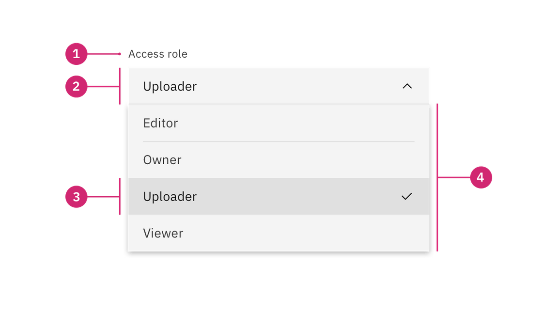
- Labels and help text (optional): Assistive text to help the user make a selection.
- Field: Persists when the dropdown is open or closed.
- Option: A list of multiple options to select from within a menu.
- Menu: Displayed as an open state and contains a list of options to select from.
Sizing
Height
There are three dropdown height sizes: Large, medium (default), and small. Use a consistent dropdown height when it is being used alongside other form components on the same page. Supporting three different dropdown sizes gives you more flexibility when structuring layouts. When in doubt, use the default medium size height.
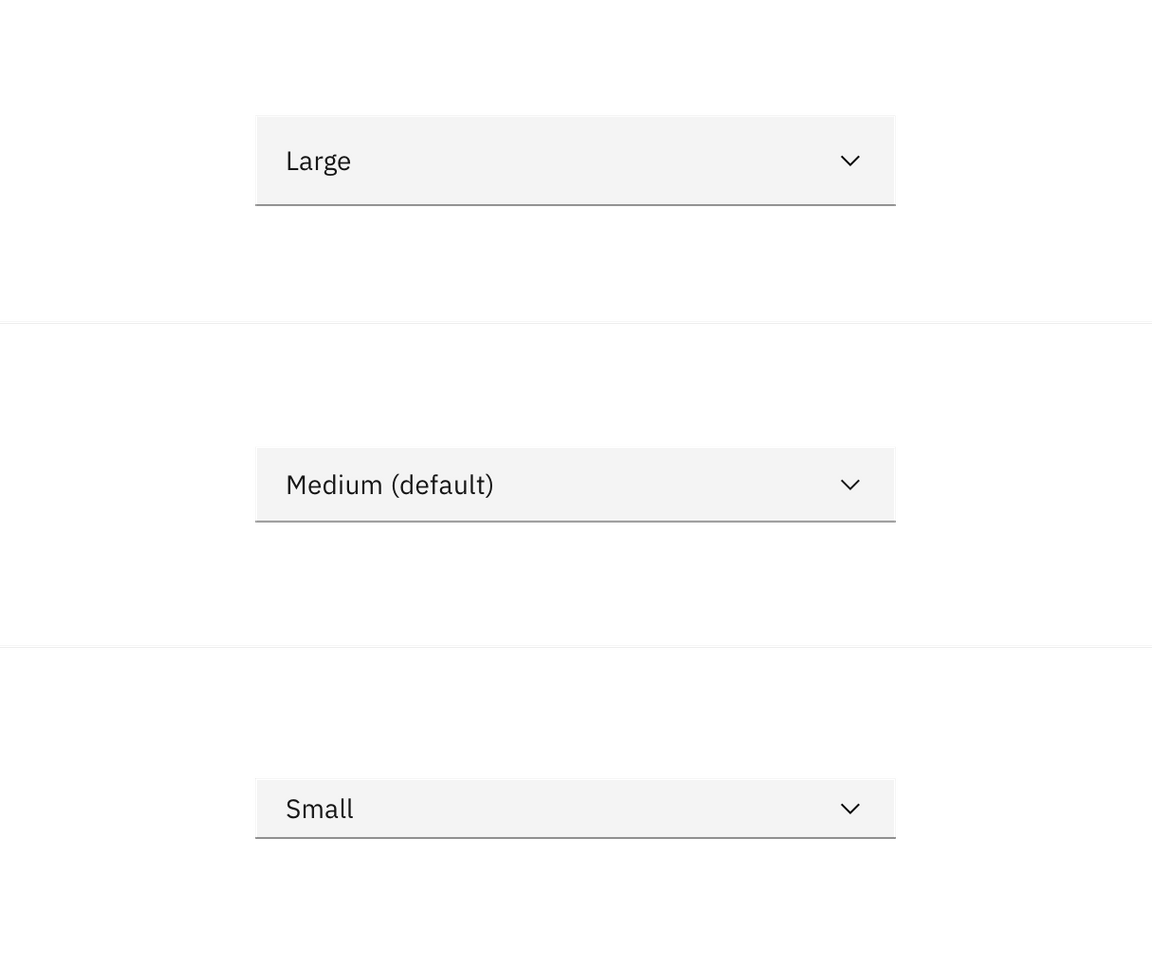
| Dropdown size | Height (px/rem) | Use case |
|---|---|---|
| Large | 48/3 | Choose this size when there is a lot of space to work with. This size is typically used in simple forms or when a dropdown is placed by itself on a page, for example as a filter. |
| Medium (default) | 40/2.5 | This is our default size and should be used whenever possible. |
| Small | 32/2 | Use when space is constricted or when placing a dropdown in a form that is long and complex. |
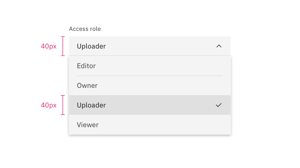
When the menu is open, each option in the menu should be the same height as the field. Use a consistent size of form components on the same page. For example, if you are using a medium size dropdown also use the same size text inputs, buttons, and so on.
Width
There is no minimum or maximum width for a dropdown. The width can be customized appropriately for its context.
Placement
Field containers should vertically align to the grid and with other form components on a page.

Do align field containers to the grid.
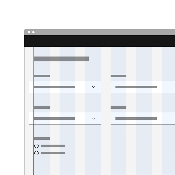
Do not align field input text to the grid and hang the container.
Content
Main elements
Labels
- Labels inform users what to expect in the list of dropdown options.
- Keep the label short and concise by limiting it to a single line of text.
Help text
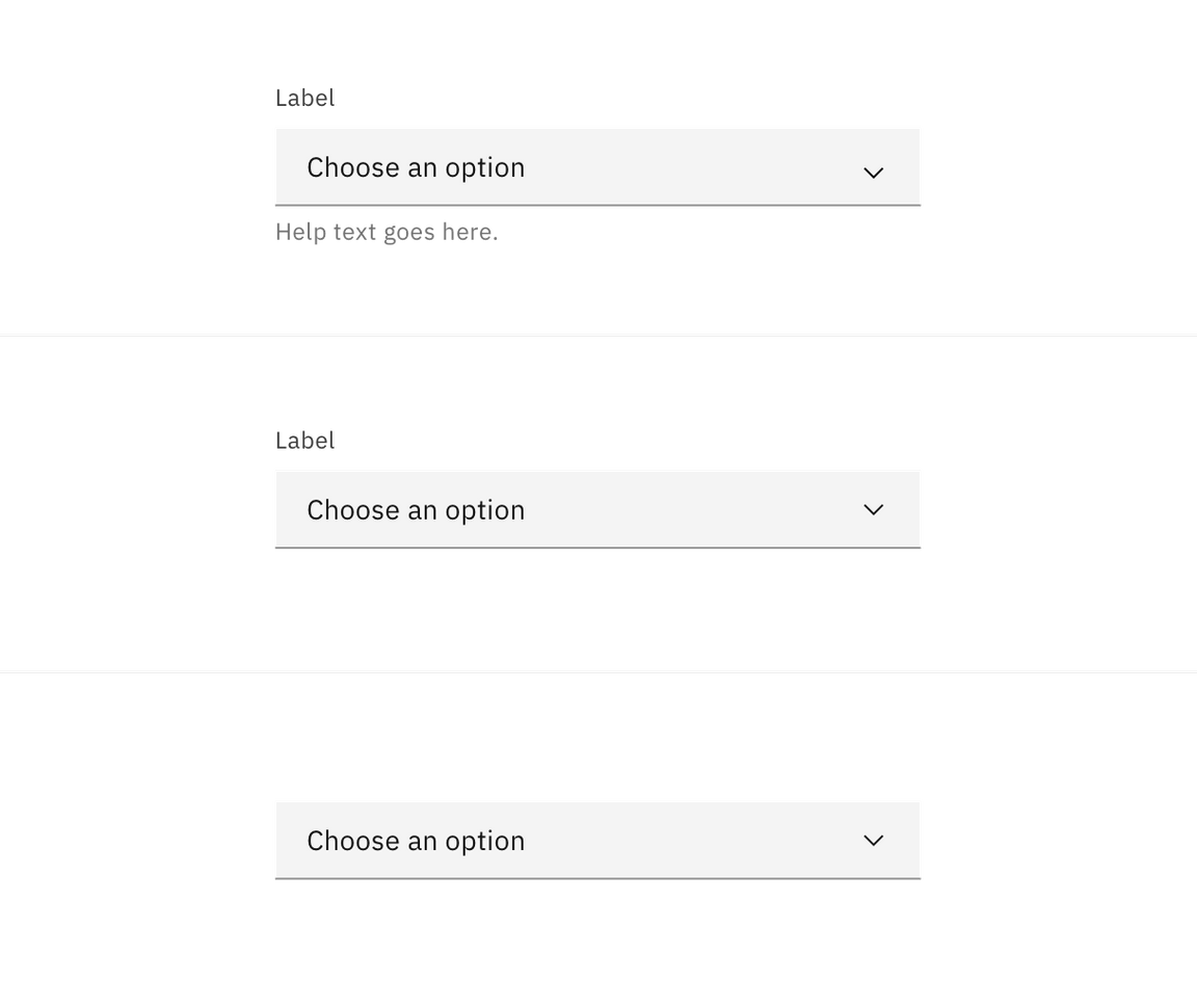
- Help text is pertinent information that assists the user in choosing the right selection from the dropdown menu.
- Help text is always available when the dropdown field is focused and appears underneath the label.
- Use sentence-style capitalization and write the text as full sentences with punctuation, unless space is limited.
Field placeholder text
- Placeholder text is presented in the field by default if no selection has been made from the dropdown. This is important to have in case the dropdown does not have a label above it.
- Use clear placeholder text for the dropdown trigger so that users understand the purpose.
Options in a menu
- Describe the dropdown option succinctly in one line of text.
- Never use decorative images or icons within a dropdown.
- We recommend presenting the options in alphabetical order.
Optional versus required fields
All fields in a form are assumed required, and optional fields are tagged. For more information, see the form component usage guidance.
Overflow content
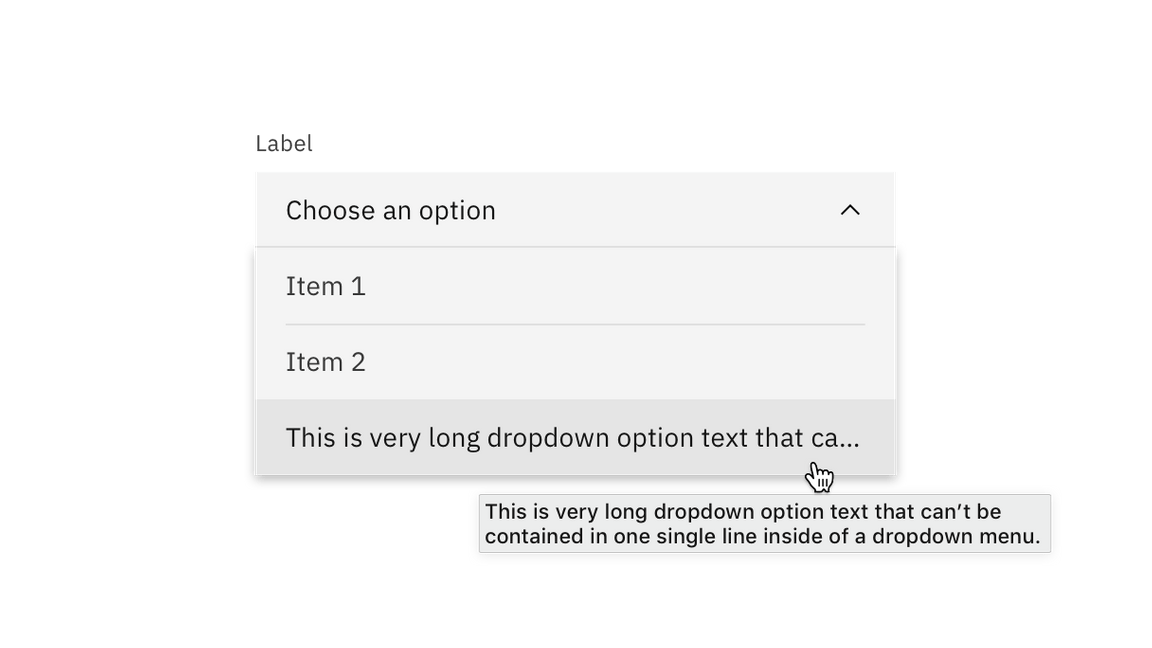
Avoid having multiple lines of text in a dropdown. If the text is too long for one line, add an ellipsis (…) for overflow content, and accompany with a browser-based tooltip to show the full string of text.
Further guidance
For further content guidance, see Carbon’s content guidelines.
Universal behaviors
The behaviors listed in this section are universal across all of the types. For behaviors that are unique to each type, see the sections below.
Direction
A dropdown can open up or down depending on its position on the screen. For example, if the dropdown appears at the bottom and close to the edge of the interface, the menu expands upward to avoid being cropped. By default, our dropdowns open downward.
Elevation
Carbon has one layer style called a box-shadow. The box-shadow is placed behind the dropdown menu when open. Box-shadow is also used in other components that have overlayed menus, such as the overflow menu and date picker calendar. The SCSS for box-shadow is 0 2px 6px 0 rgba(0,0,0,.2).
Scrolling behavior
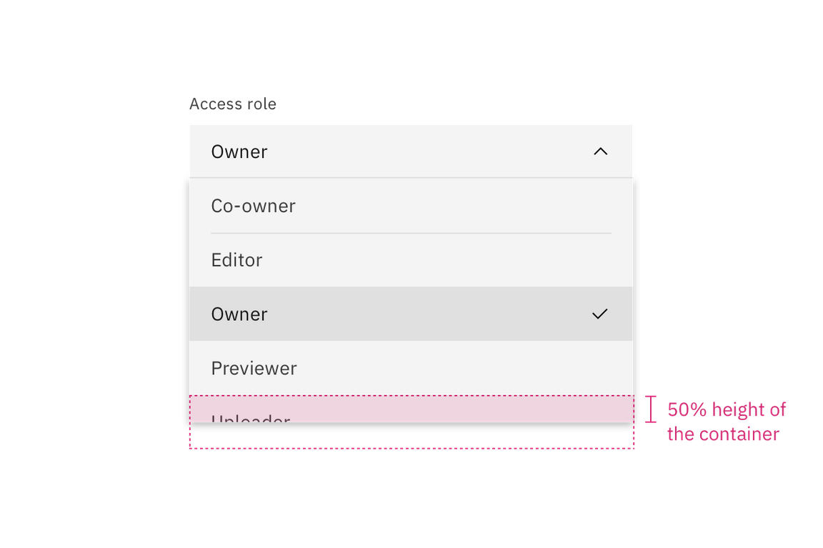
Scroll bars may not always be enabled so we recommend showing 50% of the last option’s container height to indicate there is more to see within the menu. We recommend starting a scroll at the fifth option in the menu list, but this may vary based on your specific use case.
Interactions
Mouse
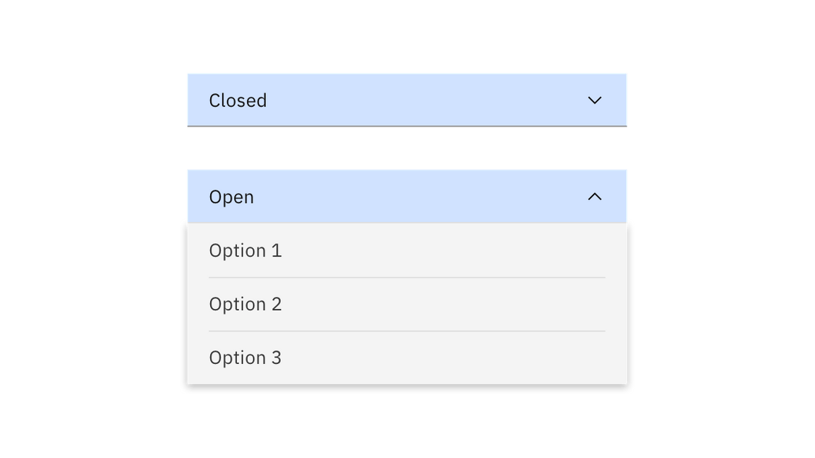
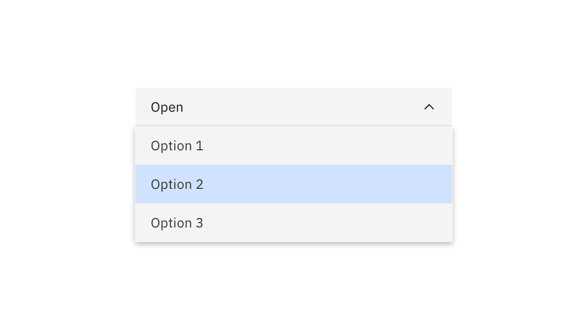
Users trigger a dropdown menu to open by clicking the chevron icon or clicking anywhere within the field. Users can close the menu by clicking the chevron icon or clicking outside of the menu. Note: You can only open a combobox by clicking the chevron icon or by typing in the field.
- To select an option the user can click anywhere inside an option container.
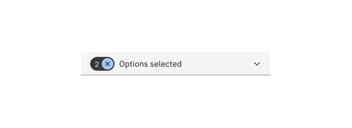
- To clear all selected options from a list in a
multiselectdropdown, click the “x” icon next to the value inside the tag.
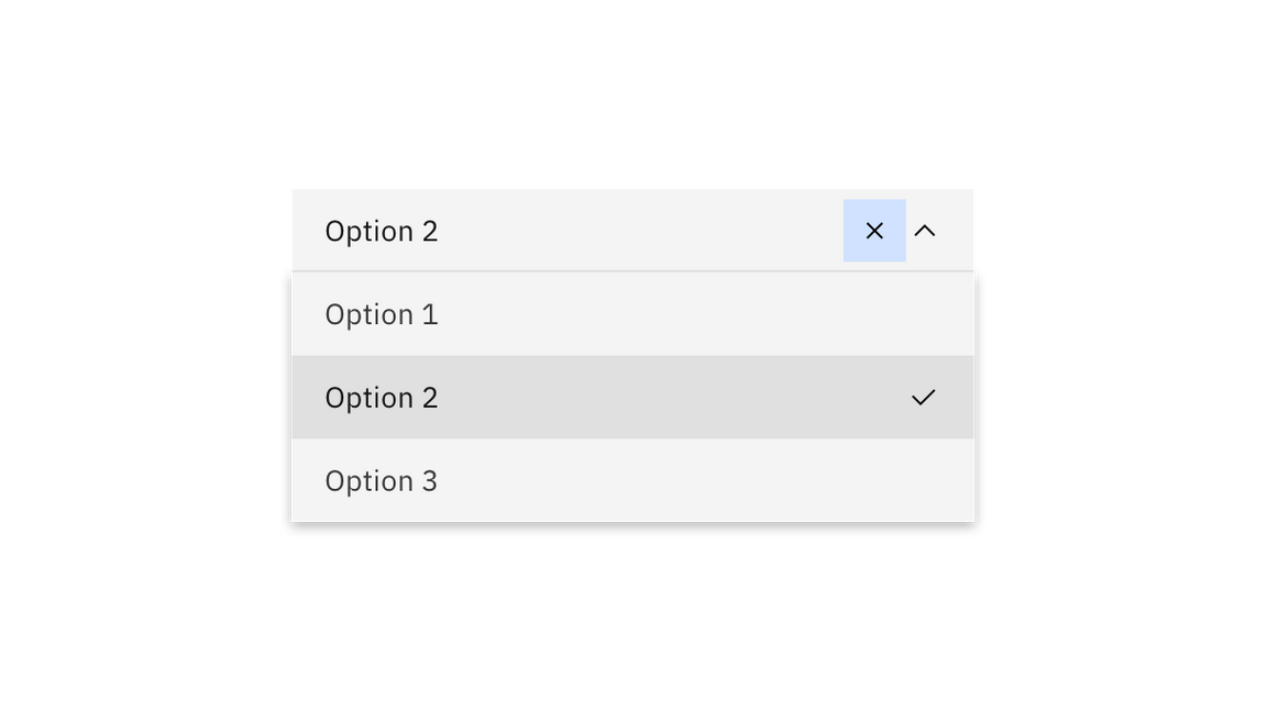
- To clear a selected value in a
comboboxor a filterable dropdown, click the “x” icon to the right of the field input text.
Keyboard
Dropdown:
- The dropdown field is the element that receives focus. All keyboard interactions happen from this element.
- Users can move the highlighted option to the next option by pressing the
Down arrow. - Users can move the highlighted option to the previous option by pressing the
Up arrow. - Users can open the dropdown menu by pressing
Space,Enter,Down arrowor theUp arrow. - Users can close the dropdown menu by pressing
Escape,Space, orEnter.
Combobox and filtering:
- When typing a character: focus stays on the field while an option in the menu is highlighted that best matches the typed character.
- When typing multiple characters in rapid succession: focus stays on the field while an option in the menu is highlighted that best matches the string of characters typed.
Multiple selection:
- The multiselect field receives focus if none of the options are selected in the menu.
- Once an option in the dropdown menu receives focus, users can press
Enterto select or deselect the option. - Users can open and close a dropdown menu by pressing
Space.
Screen readers
- Labels must be announced to the screen reader on focus. Ensure the help text that appears under an input is read when an assistive technology user stops at an input using ARIA.
- VoiceOver: Users can trigger a state change by pressing
Control-Option-SpaceorSpacewhile the dropdown field has screen reader focus. - JAWS: Users can trigger a state change by pressing
Spacewhile the dropdown field has screen reader focus. - NVDA: Users can trigger a state change by pressing
Spacewhile the dropdown field has screen reader focus.
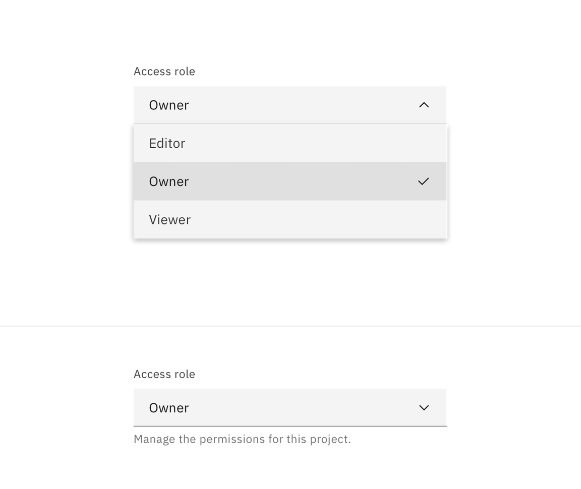
Dropdown
Use when you can select only one option from a list at a time.
- By default, the dropdown displays placeholder text in the field when closed.
- Clicking on a closed field opens a menu of options.
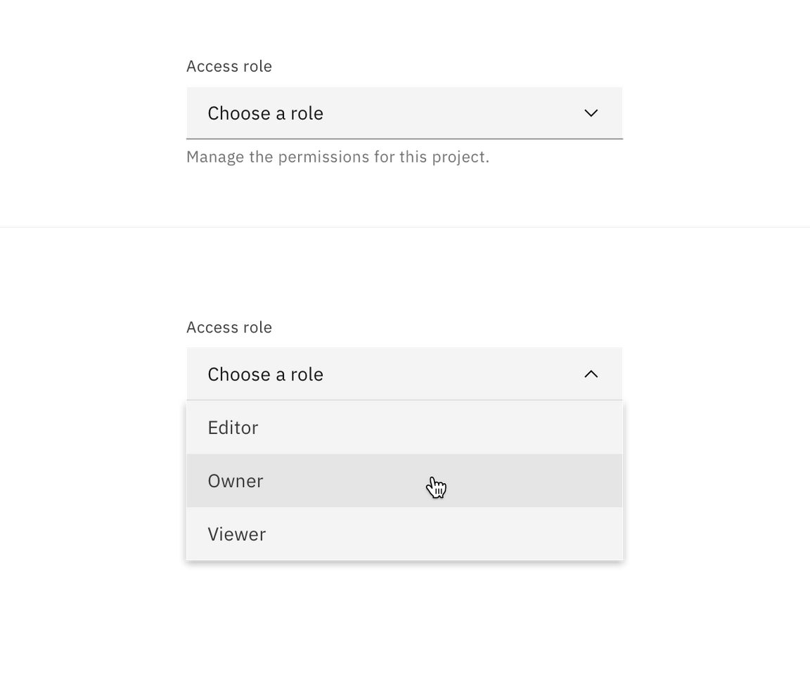
- Selecting an option from the menu closes it and the selected option text replaces the placeholder text in the field and also remains as an option in place if the menu is open.
Multiselect
Use when you can select multiple options from a list or to filter information.
Making a selection
- By default, the dropdown displays placeholder text in the field when closed.
- Clicking a closed field opens a menu of options. Each option contains a checkbox input to the left of the option text.
- The menu stays open while options are being selected. The menu closes by clicking the field or outside of the dropdown.
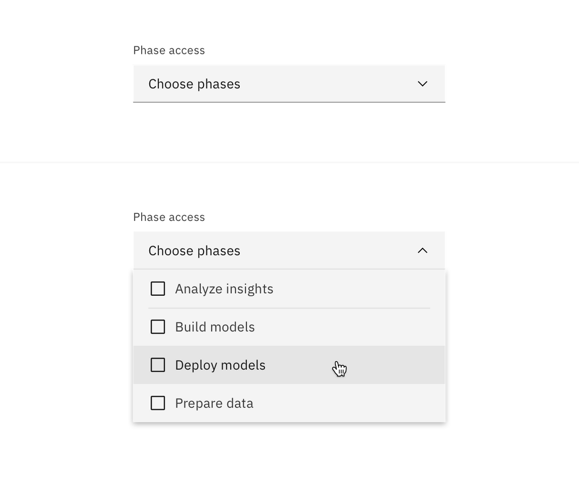
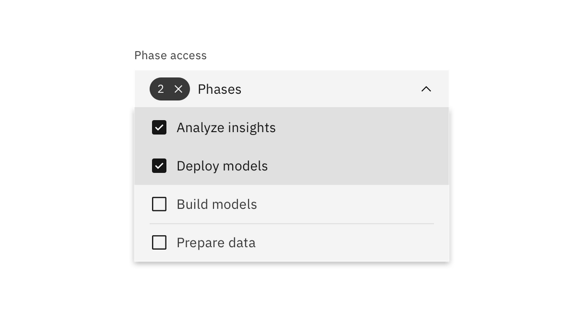
- Once options have been selected from the menu, a tag appears to the left of the text in the field containing the total number of selected options. The placeholder text can change to text that better reflects what is selected.
- Selected options shift to the top of the menu in alphanumeric order.
- Unlike dropdown and combobox, the menu does not close once the user makes selections. Because multiple selections are possible, the user needs to click outside of the dropdown or on the parent element to close the menu.
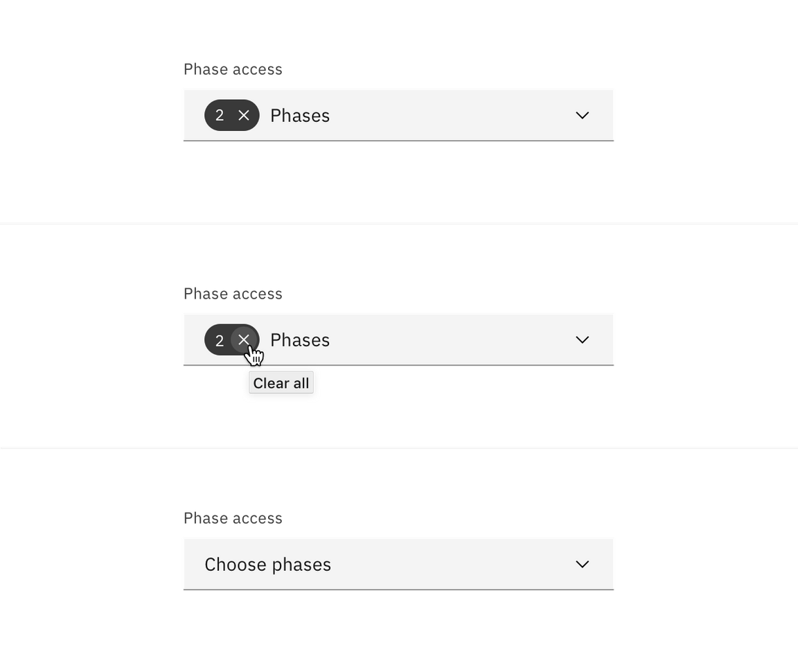
Clear all
To clear all selected options from a list, hover over the filterable tag and click the “x” (or close) icon next to the value. To help with clarity, a browser tooltip appears when the user hovers over the “x” icon to indicate the click action results. If you want to unselect individual options, you can do so by unselecting the checkbox of each option.
Filtering
Use filtering to narrow down a long list of options to find the option you want to select.
- By default, the filterable multiselect dropdown displays placeholder text in the field when closed.
- When hovering over the field, a text cursor appears.
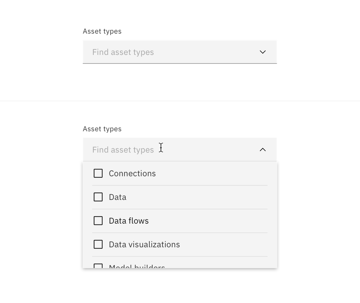
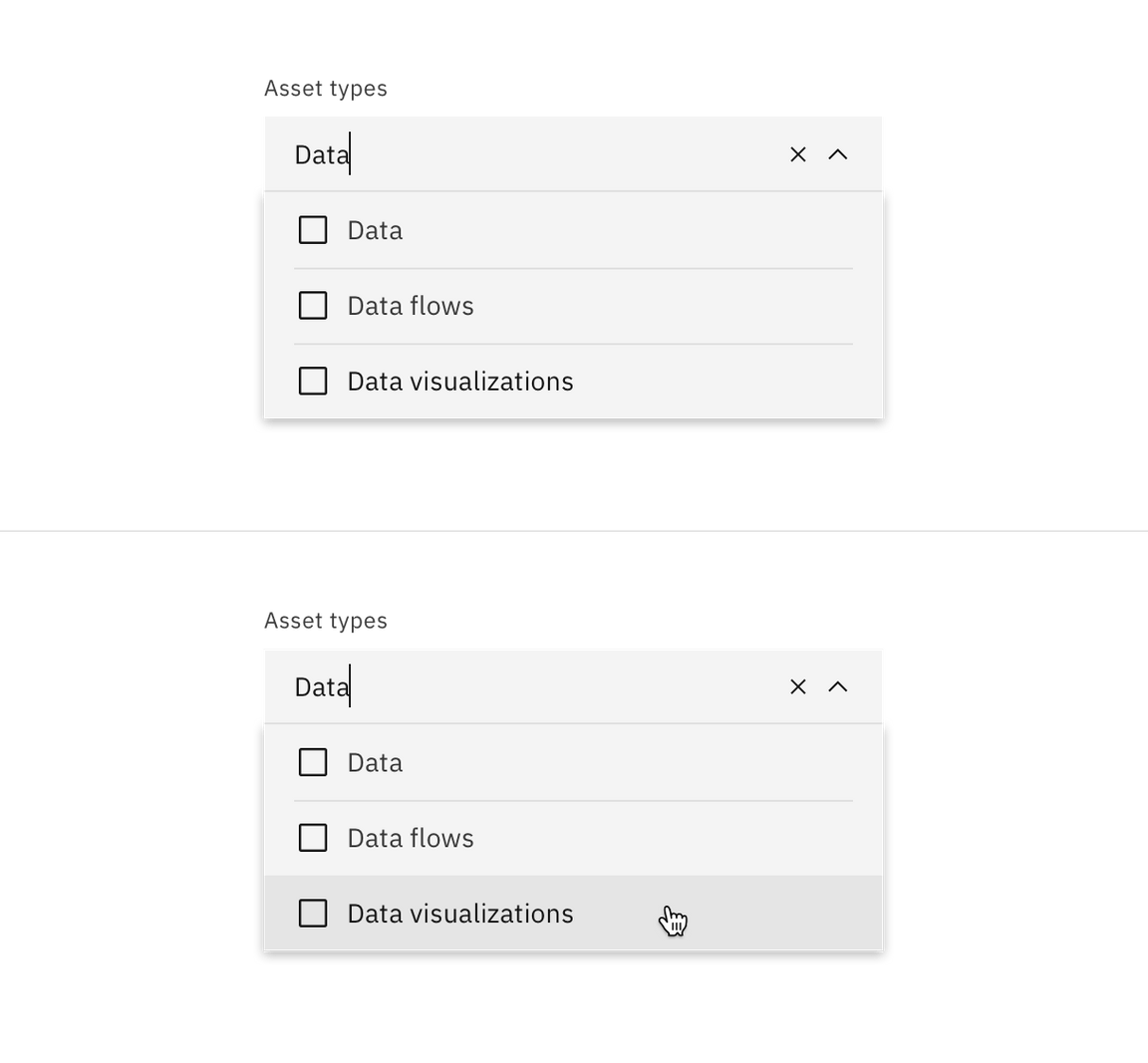
- The menu opens by clicking anywhere in the field and you can start typing to filter the list of options.
- After typing text in the field, the close (x) icon appears to the right of the text in the field. This clears any user-inputted text. The options that start to match your entry remain in the list while other existing options are temporarily removed.
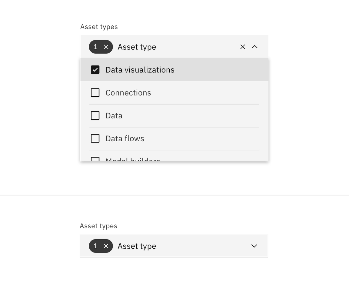
- Once options have been selected from the menu, a tag appears to the left of the text in the field containing the total number of selected options. The placeholder text can change to text that better reflects what is selected.
- Selected options shift to the top of the menu in alphanumeric order.
- Like the default multiselect dropdown, the menu does not close once the user makes selections.
Combobox
Allows the the user to make a selection from a predefined list of options and is typically used when there are a large amount of options to choose from.
- By default, the combobox displays placeholder text in the field when closed.
- When hovering over the field, a text cursor appears.
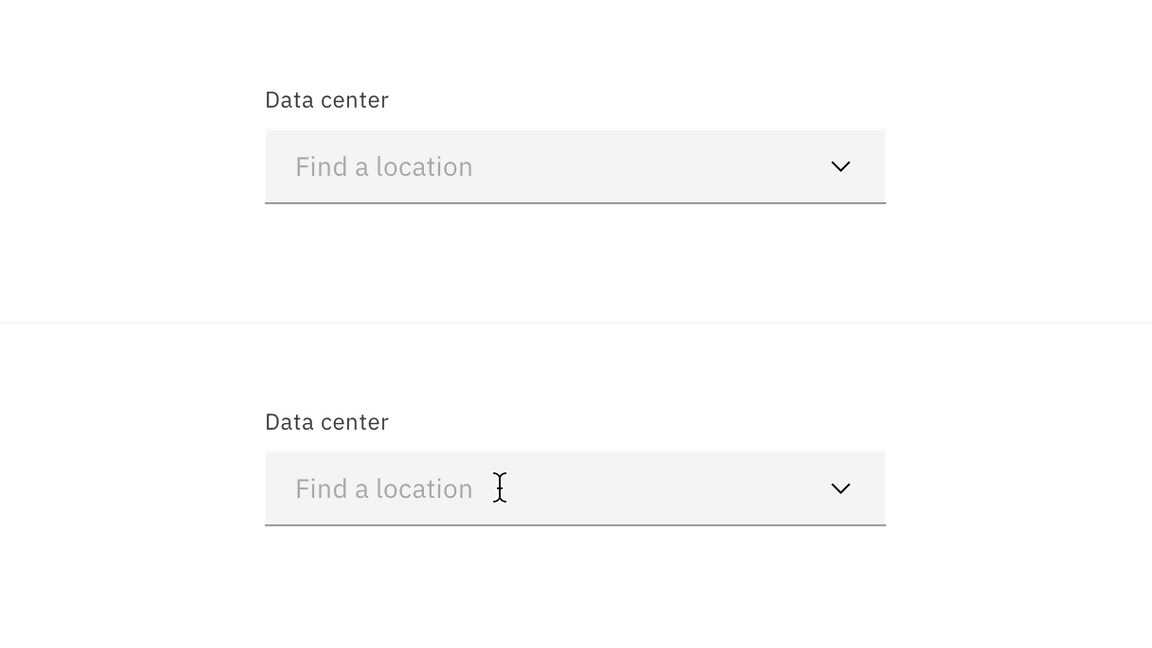
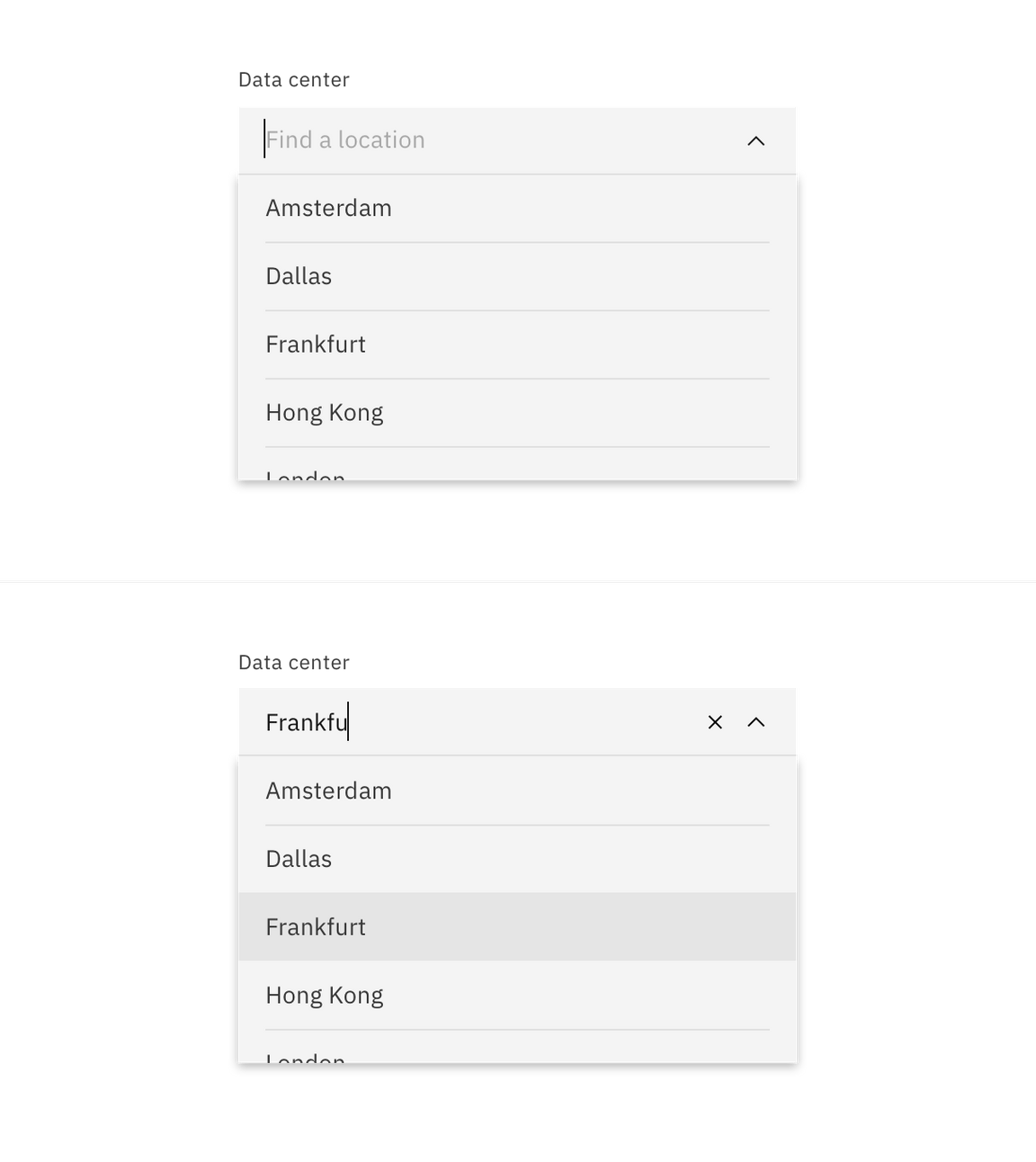
- The menu opens by clicking anywhere in the field and you can start typing to sort through the list of options.
- After typing text in the field, the close (x) icon appears to the right of the text in the field. The close icon clears any user-inputted text. The option that matches your entry receives a hover and comes into view.
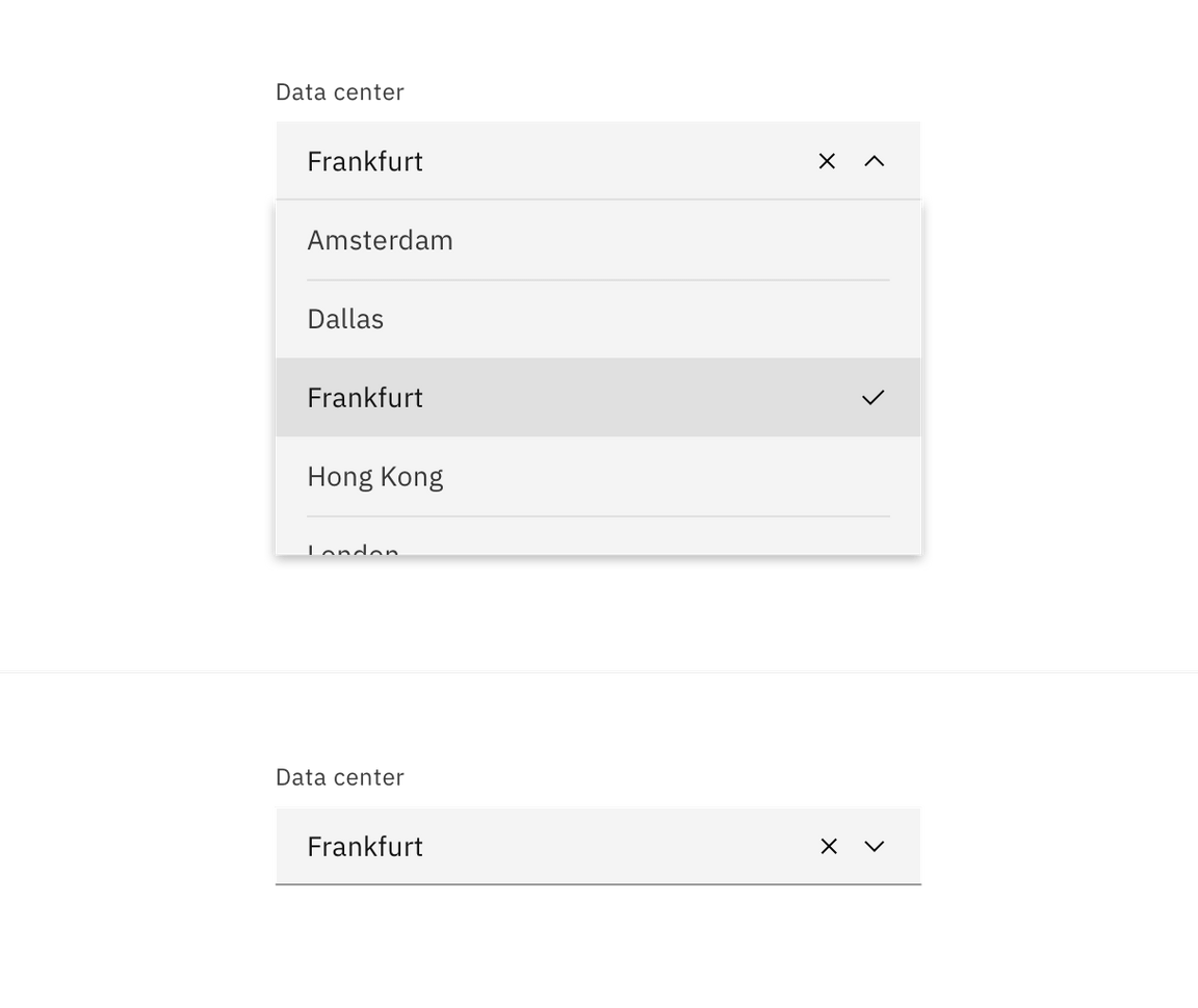
- Selecting an option closes the menu and the selected option replaces the placeholder text.
Modifiers
Inline
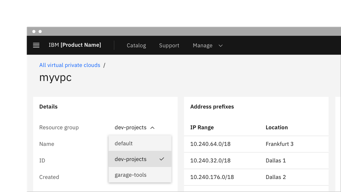
When placing a dropdown inline with other content use the inline modifier. If adding a visual label to an inline dropdown it should appear inline to the left of the dropdown. If there is no visual label present you must supply an appropriate accessibility label to the inline dropdown. Note: Inline is only a modifier for dropdown and does not have filtering functionality.
Light
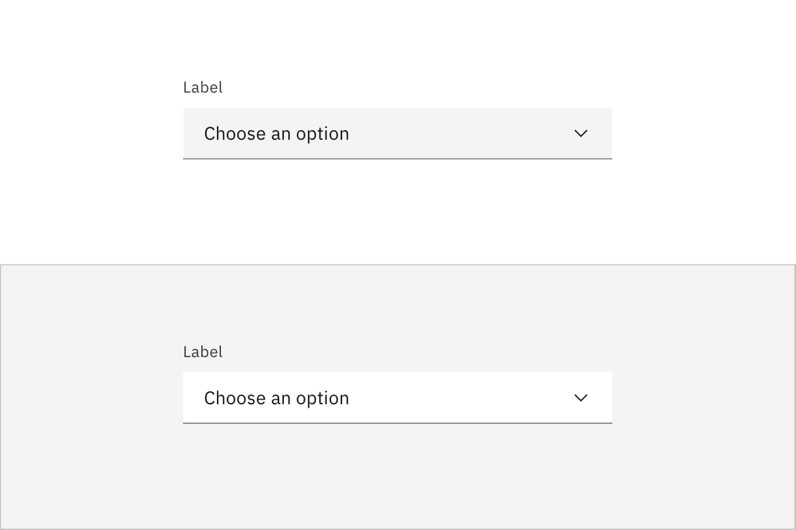
Use the light prop modifier when using a dropdown on a background other than the UI background for that theme. The light prop changes the background color token of the dropdown from field-01 to field-02. This is frequently used in form modals and side panels, or when a dropdown sits on top of a tile on a page.
Invalid
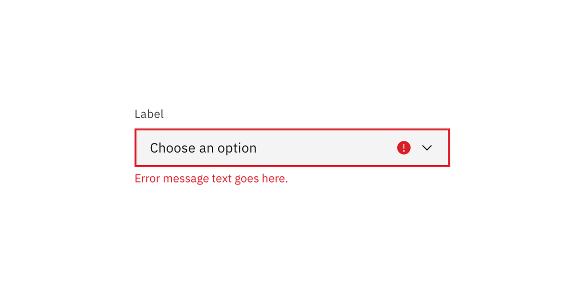
Real time validation helps to streamline the process of filling out a form. We have three indicators of an invalid state: a border, an icon indicator, and an error message. Having text, color, and weight differentiation as invalid indicators help meet accessibility requirements. For full guidelines, refer to the form component usage page.
Disabled
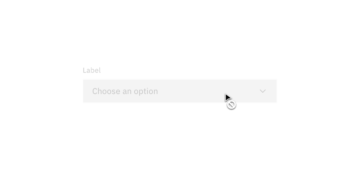
A dropdown cannot be clicked, selected, or interacted with if it is disabled. It is not read by a screen reader and takes on the default disabled visual style. Tooltips on a disabled state are also not read by screen readers and we recommend having an alternative way to show descriptive text if needed.
Related
Dropdown versus Select
Dropdown and select components have functionality and style differences.
- The underlying code of a dropdown component is styled to match the design system, while the select component’s appearance is determined by the browser being used.
- Use a dropdown component in forms, to select multiple options at a time and to filter or sort content on a page. The select dropdown does not have filtering or multiselect functionality.
- Use a select dropdown component if most of your experience is form based. Custom dropdowns can be used in these situations, but the native select works more easily with a native form when submitting data.
- Use a select dropdown component if your experience will be frequently used on mobile. The native select dropdown uses the native control for the platform which makes it easier to use.
Dropdown versus Combobox
While the dropdown and combobox look similar they have different functions.
- With a dropdown list, the selected option is always visible, and the other options are visible by clicking and opening the list.
- A combobox is a combination of a standard list box or a dropdown list and an editable text box and users are able to enter a value that isn’t in the list.
References
Angie Li, Dropdown: Design Guidelines (Nielsen Norman Group, 2017)
Feedback
Help us improve this pattern by providing feedback, asking questions, and leaving any other comments on GitHub.