Toggle
A toggle is used to quickly switch between two possible states. They are commonly used for “on/off” switches.
Overview
Toggle is a control that is used to quickly switch between two possible states. Toggles are only used for these binary actions that occur immediately after the user “flips” the toggle switch. They are commonly used for “on/off” switches.

Live demo
Content
Heading
A heading may accompany a toggle to further clarify on the action the toggle will perform.
Labels
Use labels with a toggle so the action is clear. Labels should be three words or less and appear on the side of a toggle.
Language
Use adjectives rather than verbs to describe labels and the state of the object affected.
Component types
Small toggles
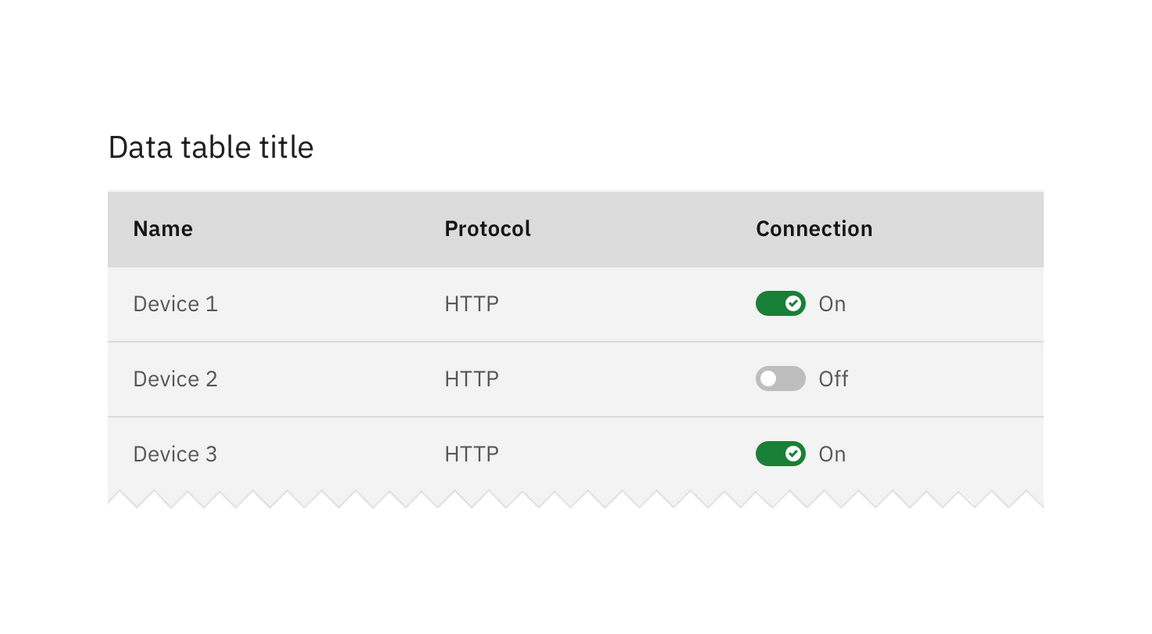
A variation on the regular component is the small toggle. Small toggles are more compact in size, therefore they can be used in use cases such as data tables.

Feedback
Help us improve this component by providing feedback, asking questions, and leaving any other comments on GitHub.